So, you’re finally ready to give your home a fresh coat of paint? Good. Because nothing screams “I’ve got my life together” like a beautifully painted exterior. I mean, sure—your lawn might still be a jungle and the mailbox is leaning at a 45-degree angle, but the right house color? That’s what people remember. And you deserve to be remembered… for something other than chipped taupe old walls.
Let’s be real—choosing the perfect exterior house color is stressful. One wrong shade and suddenly your house looks like an undercooked salmon filet. Not cute. That’s why I’ve put together 15 of the best exterior house colors, complete with thoughts, real-life vibes, and a few hot takes. Ready to find your house’s signature look? Let’s go.
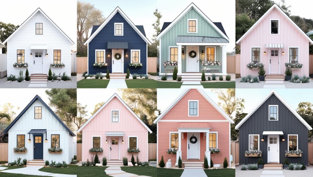
1. Classic White: The Undisputed Champion
Let’s start strong. White isn’t just a safe choice—it’s a smart one. It screams clean, timeless, and “I know what I’m doing.”
Why it works:
- It reflects sunlight, keeping your home cooler.
- It pairs with literally everything—black shutters, natural wood, bold doors.
- It boosts curb appeal like crazy.
FYI: Go for warmer whites (think: Alabaster or Swiss Coffee) to avoid looking like a hospital wing.
Personal take: My neighbor painted his house white with black trim and now it looks like a Pinterest board IRL. Mildly jealous.

2. Charcoal Gray: Moody in All the Right Ways
If white feels too safe, charcoal gray might be your soulmate. It’s bold, dramatic, and oozes sophistication.
Best with:
- Crisp white trim (for contrast)
- Natural stone or wood accents
- Modern or Craftsman-style homes
Pro tip: Avoid using this on small homes unless you have plenty of natural light. Otherwise, it can look more like a sad shoebox than a sleek architectural statement.

3. Navy Blue: The Cool Kid of Neutrals
I love navy blue. It’s moody without being over-the-top, and somehow works on beach homes, cabins, and urban bungalows alike.
Why homeowners love it:
- It feels fresh and nautical.
- It pairs beautifully with copper or brass fixtures.
- It hides dirt way better than white (trust me, I’ve got messy kids and a dog who thinks he owns the place).
My take: Add a bold red or yellow door for that perfect pop. You won’t regret it.

4. Sage Green: Nature-Inspired and Chill
You know that calm feeling you get when you walk into a spa? That’s the energy sage green brings to your home’s exterior.
Best for:
- Homes surrounded by trees or gardens
- Pairing with tan, cream, or wood tones
- Creating that earthy, modern-farmhouse vibe
Just saying: If your home’s in the desert or urban jungle, sage might not make much sense. But in a lush setting? Looks stunning.

5. Black: Bold, Sleek, and Low-Key Intimidating
Black isn’t for the faint of heart. But if you can pull it off? You’ll instantly earn “cool house on the block” status.
What to know:
- Matte black finishes = ultra modern
- Works best with minimalist landscaping
- Needs contrast—add white trim or light stone to avoid looking like a haunted mansion
IMO: A black-painted house with wood slat fencing and greenery? Architectural Digest, call me.

6. Greige: When Beige and Gray Had a Stylish Baby
Can’t decide between gray and beige? You don’t have to. Greige is the perfect in-between and looks so much more elevated than your builder’s-grade tan.
Why it’s a win:
- Works on pretty much any home style
- Feels warm but still neutral
- Looks expensive (without actually being expensive)
Bonus points if you add matte black windows or a deep blue door. Boom—instant class.

7. Brick Red: Rustic, Bold, and a Little Bit Bougie
I’m not talking about “barn red.” I’m talking muted brick red, the kind that pairs with cream trim and says, “This house has stories.”
Ideal for:
- Colonials and farmhouses
- Homes with stone or brick foundations
- People who aren’t afraid of standing out
Word of warning: Bright red + black trim = fire truck. Don’t do it unless you are a fire truck.

8. Sky Blue: Light, Airy, and Super Underrated
Not enough people go for sky blue, and honestly, I don’t get it. It’s cheerful, light-reflecting, and gives off “beach house even if you live nowhere near the beach” vibes.
Why it works:
- Pops beautifully with white trim
- Creates a relaxing, open feel
- Makes small homes look a bit bigger
Sarcasm alert: Unless you’re aiming for Smurf Village vibes, stay away from neon shades. You’ve been warned.

9. Olive Green: Moody, Earthy, and Totally Grown-Up
This one’s a little unexpected—but olive green adds so much depth without being flashy.
When to use:
- On Craftsman or ranch-style homes
- With black hardware and off-white trim
- To subtly blend into natural surroundings
Hot take: Olive green + cedar wood = outdoorsy sophistication. Like REI meets Architectural Digest.
10. Taupe: Still Basic, But a Little Better
Alright, I used to hate on taupe. But when done right, it can actually look luxe and timeless.
Pro Tips:
- Choose a warm taupe with slight gray undertones
- Pair with white or dark chocolate brown trim
- Avoid pinkish tones unless you’re aiming for “Barbie’s Dreamhouse: Sad Edition”
My advice: Upgrade your lighting fixtures. Taupe + bad lighting = NOPE.

11. Soft Yellow: Sunny Without Being Overwhelming
Yellow’s tricky. Too much, and you’re stuck in Big Bird territory. But a soft, buttery yellow? Totally charming.
Why it’s awesome:
- Feels cheerful and welcoming
- Pops against a green lawn or garden
- Great for vintage homes, cottages, and bungalows
Keep in mind: White trim is a must. Anything else makes it look… confusing.

12. Deep Forest Green: Moody Meets Majestic
Okay, if I could marry a color, it’d be deep forest green. It’s rich, moody, and blends beautifully with wood, stone, and even black.
Where it shines:
- Cabins, mountain homes, and rustic retreats
- Homes surrounded by tall trees or nature
- Paired with brass or gold hardware
Low-key tip: Add uplighting to the trees around your home. You’ll feel like you live in a fairytale.
")
13. Light Gray: The Chill Cousin of White
If you like the idea of white but want something a bit softer, light gray is where it’s at.
Here’s the deal:
- It hides dirt better than white
- Looks modern, coastal, or traditional depending on the trim
- It’s probably never going out of style
Go-to pairings: Navy doors, white shutters, or natural wood accents.

14. Terracotta: Warm, Cozy, and Full of Personality
Yep, I said it—terracotta is back. It’s warm, textured, and oozes Mediterranean charm.
Best for:
- Stucco homes or Spanish-style builds
- Dry, sunny climates (hello, Arizona!)
- Pairing with cream or dark brown trim
But: If you live in rainy Oregon, this might feel out of place. No judgment—just facts.

15. Blush Pink: Soft, Romantic, and a Little Unexpected
You didn’t expect this one, did you? But hear me out—blush pink can actually be super chic when done right.
Who it’s for:
- Risk-takers with a flair for design
- Cottage-core enthusiasts
- Anyone who wants compliments from strangers
Real talk: Go very pale and pair with crisp white or matte black for contrast. No Pepto-Bismol vibes, please.

Final Thoughts: So… Which One’s “The One”?
Choosing your exterior house color isn’t just about trends—it’s about finding the vibe that fits your personality, your home’s architecture, and your climate. What looks dreamy in California might look bizarre in Boston.
Here’s the cheat sheet:
- Play it safe? Go with white, greige, or light gray.
- Want drama? Try black, navy, or forest green.
- Feeling bold? Olive, blush, or terracotta are your new BFFs.
Quick Tips Before You Grab a Paintbrush:
- Always test swatches on different sides of your home (lighting changes everything).
- Look at it during different times of day—morning light vs. sunset = totally different stories.
- Get a second opinion. Or third. Or bribe your neighbor with cookies for theirs.
So, what’s the dream look you’re going for? Minimalist modern? Cozy cottagecore? Or maybe just “not embarrassing when guests show up”? Whatever it is, one of these 15 exterior house colors can totally help you get there.
Now go forth and paint. Your house deserves a glow-up. And let’s be honest—you kind of do too.